Infographic
https://howmuch.net/visualizations
HowMuch.net Infographics Visualizations
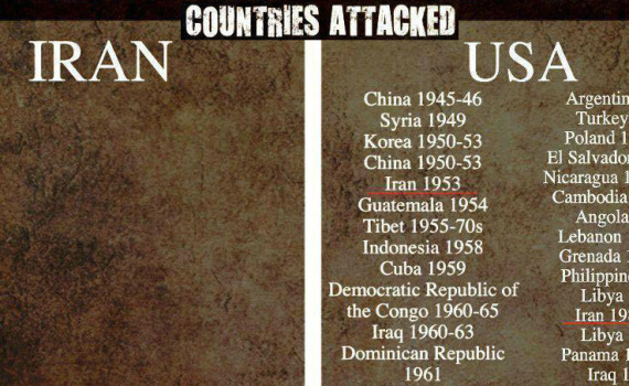
https://howmuch.net/ HowMuch.net was born with one mission: “Understanding Money.” We create unique, beautiful, compelling, and easy-to-understand guides and visualizations to help people make better financial decisions. By turning complicated economic & financial matters into digestible visuals accompanied by insightful articles, we help people become better informed about financial facts that […]
HowMuch.net Understanding Money in Infographics and Visualizations
@Thenakedpoet on Twitter made these infographics containing “life lessons gathered from various tweets” by @Naval Naval Ravikant.
Naval Ravikant Infographic
Chart shows the purchasing power of the US Dollar over time. Purchasing power has decreased due in part to inflation and Federal Reserve money printing.
U.S. Dollar Purchasing Power
Source: eReplacementParts.com
Vehicle Emergency and Safety Prepping
Infographic of Roman emperors in profile as they appeared on gold coins.
Roman Emperors
Source: Visual Capitalist https://web.archive.org/web/20240127003510/https://www.visualcapitalist.com/50-cognitive-biases-in-the-modern-world/
Visual Capitalist Cognitive Biases Infographic
What does China censor online? Censored keywords and websites in China Infographic
Internet Censorship in China
Easel.ly